End-to-end Product Design
RoadIQ is an AI-driven data processing platform that helps data operators analyze and compare pavement conditions year over year. It combines human input with machine learning to detect and visualize road surface cracks for smarter infrastructure maintenance.
View Prototype
RoadIQ is an AI-powered data processing platform created to improve how pavement condition data is analyzed and delivered. The existing tool, Vision, was slow, cluttered, and required heavy manual effort, turning what should have been a week-long task into a 129-day process, with distress editing alone taking 39 days.
As the sole UX designer, I led the end-to-end design process, from discovery to delivery. I collaborated closely with the APO and solution architect to align user needs with technical feasibility. The redesigned platform simplifies the experience by combining automation, intuitive editing, and year-over-year comparison in one web-based interface. This helps teams work faster, more accurately, and with greater confidence.
Role: UX Designer
My Contribution: User Researcher, UX Designer, UI Designer, User testing
Team size: 15
Duration: 7 months
Tools used: Figma, Miro
The existing pavement data processing tool, Vision, was outdated and overly complex, leading to a 129-day delivery cycle and 39 days spent on distress editing. Slow automation, poor usability, and the inability to compare year-over-year data made the process inefficient and inconsistent. The goal was to create a faster, smarter, and more intuitive platform that streamlined workflows and improved accuracy.
The goal of this project was to simplify and accelerate the pavement data processing workflow by redesigning the existing tool into a modern, web-based platform. The focus was on improving the user experience for data operators, enabling AI-assisted distress detection, and introducing year-over-year data comparison to make analysis faster, more consistent, and easier to manage.
The new RoadIQ platform introduces a streamlined, web-based experience that integrates automation, intuitive editing tools, and real-time year-over-year comparison. The interface allows users to easily detect, classify, and adjust pavement cracks with AI assistance while maintaining full control over accuracy.
The redesigned workflow reduces complexity, minimizes manual effort, and creates a unified space for data operators and supervisors to collaborate efficiently.
(Watch the video to see the redesigned platform in action.)
The redesigned RoadIQ platform is expected to transform the pavement data processing workflow by improving efficiency, accuracy, and overall user experience. Early user feedback has been highly positive, highlighting the platform’s simplicity and clarity compared to the old tool.
Expected to achieve up to a 82% reduction in manual distress editing time as the machine learning model matures, drastically shortening project delivery timelines.
AI-assisted detection and year-over-year comparison are expected to deliver highly accurate, consistent outputs and minimize subjectivity across operators.
Streamlined workflows and simplified tool organization are projected to reduce onboarding time for over 40 data operators and enhance productivity across teams.
The centralized web-based platform will connect on-shore and off-shore teams, creating shared visibility, smoother reviews, and more reliable quality control.

The UX research began with in-person shadowing sessions to understand how pavement condition data was processed using the legacy software, Vision. I traveled to another country to observe data operators and distress editors firsthand, gaining a deep understanding of their daily workflows, challenges, and technical environment.
While the overall data delivery process for the product family took 129 days, distress editing alone accounted for a significant portion of that time due to outdated tools and manual steps. The goal of the research was to identify where inefficiencies occurred and uncover opportunities to simplify and accelerate the process.
Insights were gathered by observing both on-shore and off-shore workflows and through interviews with users across multiple roles.
Before conducting field observations, I reviewed recordings and documentation from an earlier discovery workshop that involved Operations Leads, Delivery Managers, and Technical Supervisors. This secondary research helped establish a high-level understanding of existing workflow challenges, business goals, and system limitations within the pavement data processing pipeline. It revealed recurring concerns about long processing times, inconsistent data quality, and the lack of standardization across teams. Stakeholders also emphasized the need for stronger automation, better visibility into year-over-year data, and a simplified process that could scale efficiently across both on-shore and off-shore teams.
To better understand the pavement data processing landscape, I analyzed leading industry tools and competitors. While these companies offer strong data collection and automation capabilities, most solutions remain slow, complex, and heavily technical, making them difficult for everyday data operators to use efficiently.
Fugro already leads this space in terms of data accuracy and innovation; however, the overall pace of digital transformation across the industry remains slow. Many competitors still rely on legacy desktop systems with limited integration between data collection, processing, and delivery. This gap highlights a major opportunity for RoadIQ, to position Fugro even further ahead by introducing a modern, web-based, AI-driven platform that prioritizes speed, usability, and scalability.
(The image below represents the competitive landscape, showing Fugro leading the race toward innovation in pavement data processing.)
.png)
Following the secondary research and competitive analysis, I conducted in-person shadowing sessions and user interviews to understand the day-to-day challenges faced by data operators and distress editors using the legacy tool, Vision. I traveled to another country to observe the offshore team’s workflows firsthand, capturing how real-world conditions, team dynamics, and environmental factors influenced performance and efficiency.
The goal was to uncover pain points in the distress editing workflow, identify usability issues, and explore how automation and AI could realistically support users without increasing complexity. I observed both on-shore and off-shore teams and collaborated closely with the APO and technical architect to ensure that findings aligned with system capabilities.
Interviewed Roles:
• Distress Editors (Offshore Team)
• Team Leads and Delivery Leads
• On-shore Supervisors
Key Insights from Interviews:
• “The hardest thing to do is blindly trying to match previous years’ data.”
• “The tool has too many options and feels overcomplicated.”
• “Even with the same settings, outputs are inconsistent year to year.”
• “Training new staff takes a long time because the system is difficult to learn.”
• “The automated detection isn’t reliable enough, so we spend time fixing it manually.”
• “We waste time searching for files and figuring out which protocol to follow.”
Synthesizing Insights
All observations and quotes were consolidated in a Miro board to identify recurring themes and workflow bottlenecks. Each sticky note represented an insight or user quote, which I later grouped into clusters such as automation issues, training gaps, inconsistent outputs, and workflow inefficiencies. This synthesis helped prioritize design opportunities and guided the next phase of ideation.
(Below: Clustering of key insights on Miro to identify recurring pain points and themes.)
After consolidating insights from interviews and field observations, I organized all findings into an affinity diagram to identify key themes and patterns. Each note represented a user pain point, quote, or workflow issue, which I grouped into categories such as automation, interface layout, data handling, and business-related challenges. This process revealed that most inefficiencies stemmed from tool complexity, lack of standardization, and limited automation reliability.
From these insights, I created a primary persona representing the distress editors who interact with the system daily. The persona captured their goals, frustrations, and workflow needs, helping keep the design focused on simplifying their day-to-day tasks and improving accuracy and efficiency across both on-shore and off-shore teams.
To make sense of the large volume of qualitative data collected during research, I created an affinity diagram to cluster related insights and identify recurring themes. Each sticky note represented a user pain point, observation, or direct quote from interviews. By grouping these into categories such as automation, task-related challenges, interface layout, data handling, and specific tools, I was able to uncover key problem areas driving inefficiency. This exercise clarified the relationships between technical limitations, workflow complexity, and user frustration, laying the foundation for defining core design priorities and user needs.
Based on insights from interviews and field observations, I developed Kristin Watson, a representative persona of a Distress Editor. Kristin reflects the everyday user responsible for identifying and classifying pavement cracks using the existing software. Her challenges include spending excessive time on repetitive manual tasks, navigating an overly complex interface, and lacking the ability to compare year-over-year data efficiently. Her needs focus on a simplified workflow, better tool organization, and automated features that reduce manual effort. This persona helped anchor design decisions around real user frustrations and guided the creation of a more intuitive and supportive experience for data operators.

In the Explore phase, I translated research insights into tangible design solutions, starting with detailed userflows that mapped the ideal experience for distress editors, QC reviewers, and delivery leads. These flows formed the foundation for low-fidelity wireframes, where I focused on simplifying navigation, grouping tools by task type, and clarifying key actions. After several rounds of iteration and feedback with the discovery team and stakeholders, I developed a mid-fidelity interactive prototype to test the initial concept. This prototype allowed stakeholders and users to visualize the end-to-end process, validate key interactions, and ensure that the redesigned experience addressed the most critical workflow challenges identified during research.
Current Process:
The existing distress editing and quality control workflow was highly fragmented and time-consuming. Tasks moved between multiple teams, tools, and spreadsheets, resulting in inconsistent outputs and communication gaps. Data operators had to perform several manual steps for lane edits, crack classification, and QC verification, while progress tracking was managed separately in spreadsheets. These handoffs and rework loops extended turnaround times and reduced overall accuracy.
(Image below: Current Distress Process and QC Flow illustrating the manual, multi-step process.)
.svg)
Proposed Userflow:
The new userflow consolidates the entire process into a single, connected system tailored to each role — Distress Editor, QC Reviewer, and Delivery Lead. It introduces automation, clear task ownership, and built-in year-over-year comparison to streamline operations. Distress Editors can now view, edit, and verify pavement cracks within one interface, while QC Reviewers can validate, flag errors, and send feedback in real time. The new flow eliminates redundant steps, reduces rework, and enhances transparency across teams.
(Images below: Refined userflows for Distress Editing, QC Management, and Task Assignment — created based on research insights and used as the foundation for wireframing.)

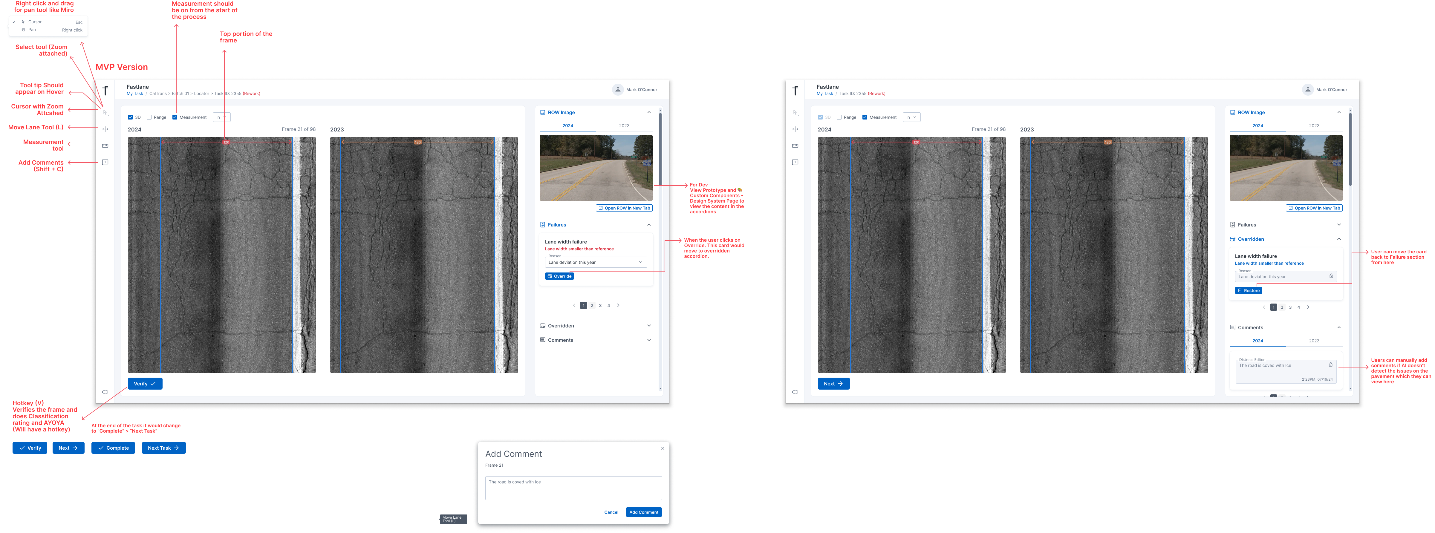
Based on the new userflow, I created low fidelity wireframes focused first on the Distress Editing experience, since this was the most time consuming and critical part of the workflow. The wireframes explored how editors would view imagery, draw and edit cracks, review AI suggestions, and compare year over year data within a single, focused workspace. I simplified the layout by grouping tools by activity type, placing frequently used actions closer to the image, and reducing the number of visible controls at any given time to lower cognitive load.
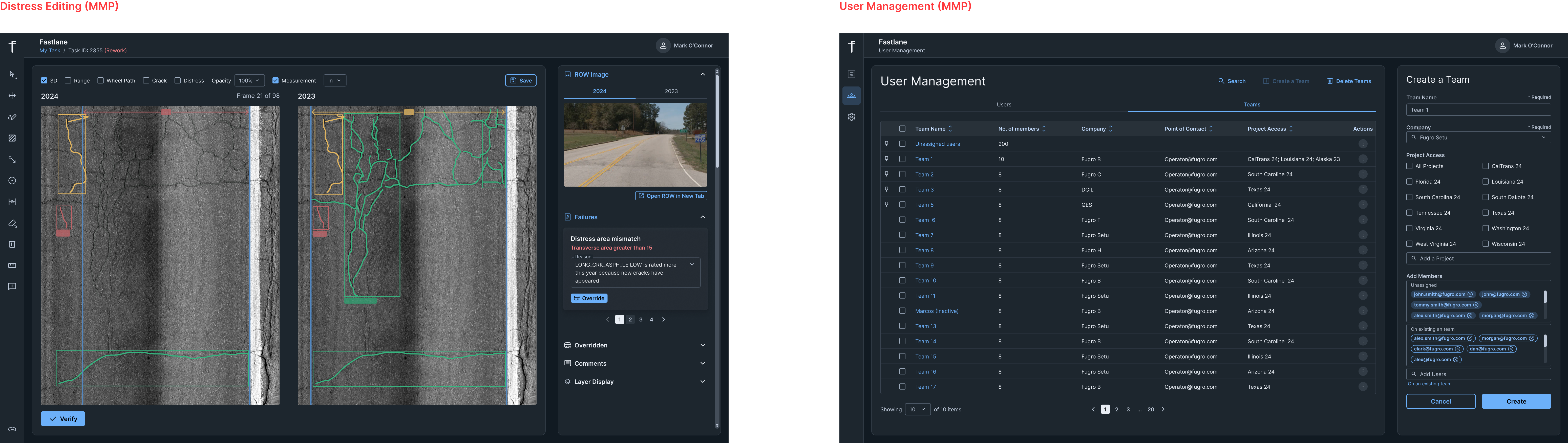
Once the core editing experience was defined, I worked with the team to identify the need for a separate management portal to handle task assignment and oversight. I then created additional wireframes for Project Management and User Management, where leads could assign only the frames that required editing to specific operators, monitor progress, and manage workloads more efficiently. These supporting flows ensured that the distress editing UI was not overloaded with management tasks, while still keeping the overall system connected end to end.
After validating the low fidelity flows with the discovery team, I moved into an initial design version to gather more concrete feedback from users and stakeholders. This version introduced a clearer layout, basic visual hierarchy, and more realistic components while still remaining flexible enough for change. I built an interactive prototype that walked through key tasks such as editing cracks, reviewing AI output, and handling QC feedback, and used it in review sessions with distress editors, leads, and stakeholders.
During this stage, I also created custom UI components directly in Figma using advanced prototyping features. This helped simulate real interactions more accurately and ensured consistency across the interface as the design matured.
In parallel, I involved the technical architect and senior developer early in this stage to confirm feasibility, performance considerations, and integration points with existing systems. Their input helped refine interaction patterns such as how results are saved, how large image data is loaded, and how task states are updated. This alignment at the initial design stage reduced the risk of rework later and ensured that the final solution would be both usable for editors and realistic for the engineering team to build.


In the Deliver phase, I tested the prototype with offshore Data Operators and a Supervisor to validate the workflow and uncover usability gaps. I documented insights in a user testing plan and presented the findings, along with proposed solutions, to the Discovery Team including the Technical Lead, Innovation Manager, Technical Architect, and APO. Based on feedback, I refined the initiail prototype into a high fidelity prototype and aligned closely with engineering on feasibility. We established a phased delivery approach, starting with an MVP focused on lane editing to accelerate development, followed by distress editing as part of the MMP release.
User Testing Session
Tester: Akash Panicker
Participant: Supervisor (Rating and QC Team)
Session Duration: 1 hour
Test Objectives
Evaluate usability
• Assess if users can easily navigate the editing and QC interface
• Identify UI friction points or unclear actions
Understand user behavior
• Observe how supervisors review frames and switch between image types
• Understand how they verify or fail a frame during QC
Gather feedback on workflow alignment
• Validate if the proposed UI supports real quality control requirements
• Identify missing capabilities for random sampling and year to year review
Validate design decisions
• Confirm whether layout, tool placement, and visibility match supervisor expectations
• Ensure alignment with current QC mental models and terminology
Distress Editing Usability Testing
Participant: Data Operators
Experience Level: Expert in Vision and Year to Year review
Familiarity with New Platform: First time interacting with the redesigned UI
Success Rate: Partial success
Observations:
• Users quickly found lane editing but struggled when lane paint was not visible
• Measurement visibility helped place markers accurately
Quotes:
• “When the white strip is not visible, I adjust the lane to the corner.”
• “Seeing the measurements helps.”
Key Issues:
• Need clearer visual guidance when lane paint is missing
Success Rate: Success
Observations:
• Users understood crack drawing tools
• Severity update process required more effort
• Missing right click options slowed editing
Quotes:
• “How do I change the severity quickly?”
Key Issues:
• Severity and editing actions should be more accessible
Success Rate: Partial success
Observations:
• Verify button location caused extra steps
• Verifying each frame individually increases repetitive clicks
Quotes:
• “Do I need to click verify every time?”
Key Issues:
• Repetitive confirmation increases time and user fatigue
Participant: Supervisor
Experience Level: Expert in Vision and Year to Year review
Familiarity with New Platform: First time interacting with the redesigned UI
Success Rate: Partial success
Observations:
• Participant expected all image types (LCMS 3D, range, and row images) visible for both years
• Row images needed for construction and pavement change detection
Quotes:
• “I would want all of the image types open.”
• “It is important to see both row images to compare what changed this year and last year.”
Key Issues:
• Limited image visibility restricted confidence in QC decisions
Success Rate: Partial success
Observations:
• Participant asked if they must manually pass each frame
• Requested hotkeys for faster pass or fail actions
• Needed a comments interaction for justification
Quotes:
• “Do we have to press pass for every frame?”
• “Can I add comments here too if I wanted to?”
Key Issues:
• Manual clicks increase effort
• Commenting not clearly integrated into workflow
Success Rate: Success
Observations:
• Supervisor explained how random sampling drives QC priorities
• Expectation that the system selects samples using a random mathematical method• Needs visibility into both asphalt and concrete sections
• Random sampling should highlight failing year to year areas first
Quotes:
• “We have 3 different levels of random sampling.”
• “We prioritize the failing parts of the batch.”
Key Issues:
• Random sampling controls not yet defined in UI
Task Management Usability Testing
Participant: Team Lead
Session Duration: 45 minutes
Success Rate: Successful
Clicks: 6
Key Insight: User first clicked the Team Lead list instead of Bulk Assign
Success Rate: Successful
Clicks: 4
Key Insight: Flow felt straightforward and matched their real process
Success Rate: Partially Successful
Clicks: 1
Key Insight: Needed clearer next actions after opening the task list
After multiple rounds of user feedback and internal reviews, I created a high fidelity prototype that represented the final interaction patterns and visual direction. This version included fully customized components designed in Figma and realistic editing behaviors to ensure developers clearly understood the intended experience which included Shortcut Keys as well for fast pace processing for users. Working closely with the engineering team, I prepared both the MVP version focused on lane editing and the MMP version that included distress editing and QC functionality. I marked UI components as Ready for Dev in Figma and supported implementation by exporting clean UI code using Figma plugins and Figma Make, which significantly reduced development time. These assets were directly linked to JIRA tickets for smooth handoff and ongoing collaboration with the Angular development team.

This was my biggest project during my time at Fugro, and it taught me how to design for a complex, high-impact workflow where usability directly influences operational efficiency. I learned the value of involving both users and engineers early, validating ideas continuously, and balancing user needs with technical constraints. Collaborating across time zones with onshore and offshore teams strengthened my communication and alignment skills, especially when gathering feedback and refining design decisions. I also grew in translating highly technical processes into intuitive, scalable interfaces while supporting development through clear documentation and efficient handoffs. This project reinforced how iterative design and thoughtful interaction details can significantly improve real-world performance and user satisfaction.

Get to Know the Designer Behind the Pixels

UX Designer
Role- UX Researcher
Mobile and web based IoT-Powered Solution for Streamlining Inventory Tracking and Optimization

User Research
Role- UX Researcher
Exploring the Future of Receipts Management: A Study on Technological Tools and User Behaviors.

Product Design
Role- Product Designer
Improving Sales Team Efficiency through Intuitive CRM System

UI/UX Design
Role- Information Architect • UI Designer
Website redesign using different Information architecture testing methods


.svg)